A clever short piece - award winning animated short
http://www.logorama-themovie.com/
Thursday, 29 April 2010
Tuesday, 27 April 2010

idN magazine

idN magazine - an interesting collection of creative talent. As the website states - an international network of designers.
The image is not from idN - it's a squashed sweet seen on the pavement in Stoke-On-Trent last summer - a colourful swirl.
Monday, 26 April 2010
Magically enduring: The magic tree
A design classic? Magic Tree air freshner - the little green card tree that hangs in cars to give a particular smell. When was this invented and by who? Are the vanilla yellow versions as good as the original pine; are the jazzy coloured alternatives as effective?
It's curious to see the shapes and colours of different air freshners designed to dangle in a car - almost toy like these apparently functional scent saturated, smell eminating designs are popular in taxis - and often a necessity.
In fact taxis often display some surprising designs - the dashboard ornaments; the family photographs...and the rather nasty seat covers that no doubt mask even nastier original seat surfaces below. The beaded seat covers.....
Back to the Magic Tree ...interesting name...enduring form.

Sunday, 25 April 2010
a puzzle
Boscombe-based jigsaw company Victory - produced jigsaws for many years.
Plan to track some down - see what they are like. Hopefully some nice kitsch images...
Plan to track some down - see what they are like. Hopefully some nice kitsch images...
Large England flag, Bournemouth

Bournemouth, Lansdowne - Christchurch Road. Apparently works on a key building are being screened by a very large St. George's flag. This huge flag is quite a surprise to come across - bold.
Friday, 23 April 2010
On Trial Logo by Jonathan Cleave
Another lion...
 A lion a day keeps me happy.
 Each day I go big game hunting - attempting to track down a graphic lion. This is surprisingly easy as so many abound across our urban landscapes. They stand proud in cityscapes: logos and decorative emblems across a myriad of contexts. Each day I record a new one - photographed and noted - adding to my visual collection - a graphic pride; a design cliche; a popular motif.
For me it's the Lion Rampant that's strong - the crowned lion another nice type.
The image of the lion on UK eggs, stamped in red, presents a symbol of quality - it provides reassurance. A trusted guardian...

planner/diary - managing time and work
Time management, planning, organisation - keeping commitments and responsibilities logged and controlled- is important in days filled with different activities. I've used a variety of different diary systems - traditional and digital - and always seem to come back to one favourite method: a physical A5 week to a view paper diary/planner.
Throughout my academic studies and professional work I've kept a diary of daily events ...teaching schedules, important meetings, deadlines, spending, contacts etc which have been penned, stapled and glued into the paper pages of a diary. I've kept all my diaries - although some years I'd rather never revisit again. They are all stored - lined up and available should I need to cross reference something from the past - quickly. Doodles on pages often suggest how I felt at a certain time...biro marks that have been added as particular prompts or playful lines to circle round specific points.
The academic year diary shapes my year and accompanies me everywhere. It's often the first thing I look at in the morning and no one day escapes without significant scribbled entries. The diaries document my work and their forms are extended with additional papers, secured with rubber band and bulldog clips, which leave the diary bulging at the end of a year. Coloured sticky notes decorate the pages - layers of square messages to myself that I want to ensure I action. Their ticked off forms provide satisfying record of completion and achievement. The pleasure of starting a clean, flat new diary offers a delicious start to the new academic year.
I've tried various Filofax forms: small, A5 and bigger ...leather, cloth and zipped versions ..they've been good but may be a little too precious for me. The ring binder system works effectively and the additional inserts - maps , rulers etc are satisfying to purchase - but my preference is for another type.
I love a Quo Vadis Principal A5 academic year Agenda Planning Diary- especially the red leatherette cover one , although the blue wasn't bad. Here I've found what I consider to be the best diary. The smooth, quality paper that sits flat when open and doesn't let ink/ballpoint/pencil show through on the next page, offers real luxury. The feel of the paper is great and makes writing pleasurable. The perforated corners help quickly locate which week I'm in and where in the dairy I am. The detachable address book is great and the maps offer valuable reference points - and entertaining distraction on occassion.
Originally designed in 1954 Quo Vadis examples have been more readily available in the UK in recent years. I bought my first one in Canada some years ago and have stuck with them since.
Although working with a Canadian example meant the UK bank holidays were not readily entered, which on occassion I overlooked, overall my first use of the Quo Vadis Principal was so great I don't think I'd change now.
Over the years I've sectionalised work into different diaries - separate diaries for key projects; a small one for my handbag - but I keep my big red diary as the central log. It's this one that operates as the nerve centre for my work. This year I purchased a lovely square pink Quo Vadis - the Executive 2010 - 13 month (16x16cm). This feels great..the square format so pleasurable to work with - makes work feel that little bit better - a decadent functional diary that just feels good.
Computer, mobile and i-phone apps diary types have their uses....and I use these too but not to the same extent as a paper diary. But perhaps I'm old-school when it comes to a diary. I like the feel of the pen on paper; I love the physical weight of a diary; the ease of its use where I don't need to charge a battery. I like writing with a pen (preferably a black Bic biro) when organising my work...
Tuesday, 20 April 2010
Presentation Skills for Students . 2nd edition
Joan van Emden and Lucinda Becker . 2010. Palgrave Macmillan Publishers Limited
Joan van Emden and Lucinda Becker . 2010. Palgrave Macmillan Publishers Limited
Monday, 19 April 2010
Quality Street sweet tin - when did the lady and gentleman disappear from the brand's design? The elegant characters featured on the tin's design for years... classic images that immediately identified this particular make.
The colourful cellophane wrappers of such confectionery sparkled like tempting jewels ..the heaviness of the tin confirming a tempting treat.
Bring back the couple?
Image courtesy of MoDiP (Museum of Design in Plastic at the Arts University College at Bournemouth, Dorset, UK)
 sweet tin - when did the lady and gentleman disappear from the brand's design? The elegant characters featured on the tin's design for years... classic images that immediately identified this particular make.
The colourful cellophane wrappers of such confectionery sparkled like tempting jewels ..the heaviness of the tin confirming a tempting treat.
Bring back the couple?
Image courtesy of MoDiP (Museum of Design in Plastic at the Arts University College at Bournemouth, Dorset, UK)

What's particularly amazing is this is a jeans label for a brand for sale - hanging in a market in Hinckley, Leicestershire c. 1995 - where the label was really eye catching. With nothing really to do with the brand or the jeans, the use of a bit of sci-fi design on a large card label with the screaming Amazing added a bit of wow. The jeans had a variety of comparable labels too....worth keeping.
Sunday, 18 April 2010

The Bic pen - transparent barrel pen that writes so well for ages. Cheap, comfortable and so good to write with. Despite so many pens over the years with miles of writing, the Bic pen is always the favourite for long haul work. Whilst the cap is usually lost and the pen end often chewed, the actually ink flow and weight of the pen still suits ....a classic.
The little Bic man is also a beaut design - the silent sentry who has the shiny ballpoint head.
Across the internet sites showcase much work in illustration done with ballpens. Is it true that Bic invites customers to completely use a ballpoint? How many letters will a Bic write I wonder..designobserver
10 Things That Need To Be Redesigned by Jessica Helfand - article 2008 www.designobserver.com
From lottery cards to political lawn signs this top 10 suggests some interesting examples where design could be improved. I quite like the overt tackiness of some lottery cards - interesting as they change with culture; time of year, popular culture and classic good luck symbols that are used.
Other things that could do with a redesign....the pouring mechanisms on some fruit juice cartons...
Curious about Curious Boym

Just ordered Curious Boym on Amazon.
(Image from Amazon)
By Constantin Boym - curious creative designs apparently.
The design company:
www.boym.comFriday, 16 April 2010

useful sources
Keeping up to date with developments across the media and design:
Marketing by Brandrepublic.com - weekly news - chunks of updates
Campaign published by Haymarket - weekly
Marketing by Brandrepublic.com - weekly news - chunks of updates
Campaign published by Haymarket - weekly
NME redesign
A publication that we perhaps grow up with and away from - the New Musical Express - the NME. First published in 1952 the popular music publication has charted developments in music for many generations. http://www.nme.com/home
Apparently owing to declining sales the NME has been recently redesigned. The on-line NME curently has an interesting article on the 20 most valuable album covers ever.
Apparently owing to declining sales the NME has been recently redesigned. The on-line NME curently has an interesting article on the 20 most valuable album covers ever.
Wednesday, 14 April 2010
The Laughing Cow

A classic logo - the laughing cow- borrowed and used in an advertisement in Toronto.
Signs ....and ghostsigns
 A laundrette Dry Cleaning sign in Stoke on Trent - jazzy type and wonderfully dated. But still functional. One of the many signs seen on a daily basis across the highstreet.
April's edition of Creative Review magazine has an interesting article on Ghostsigns. The notion of faded advertising signs, hand painted on the sides of buildings - often advertisements from the past that still remain long after the shop or product has disappeared.
Ghostsigns often appear in towns and cities - the collection in the Creative Review Monograph publication are from the History of Advertsing Trust collections. (HAT collection is the great resource based in Norfolk). Discovering ghostsigns (lovely term) in derelict areas of cities is quite a surprise - amazing how many still abound.
Tuesday, 13 April 2010


Framework for design principles
'Created by the AIGA Center for Sustainable Design (CFSD), the Living Principles for Design were born out of the design profession’s need for an aspirational and actionable framework for integrated sustainability—a common point of reference to which all designers can refer. Its ongoing development is dependent on the contributions of the design community at large. Conceived and developed over the summer of 2009, the Living Principles were officially unveiled at the AIGA Design Conference in Memphis on October 9, 2009.'
http://www.aiga.org/content.cfm/the-living-principles-for-design
see the Manifesto: http://www.aiga.org/resources/content/7/3/1/2/documents/AIGA_The_Living_Principles_Framework.pdf
http://www.aiga.org/content.cfm/the-living-principles-for-design
see the Manifesto: http://www.aiga.org/resources/content/7/3/1/2/documents/AIGA_The_Living_Principles_Framework.pdf
Jonathan Klein: Photos that changed the world | Video on TED.com
Jonathan Klein: Photos that changed the world Video on TED.com
TED - presents Jonathan Klein talking about key powerful photographs that changed the world.
Images of our world that are iconic and challenging.
TED - presents Jonathan Klein talking about key powerful photographs that changed the world.
Images of our world that are iconic and challenging.
Monday, 12 April 2010


Fuit box graphics

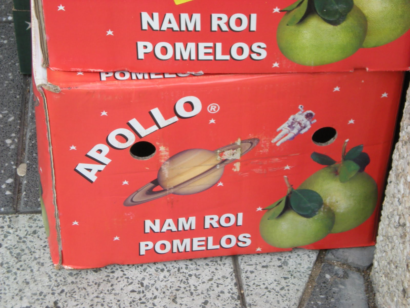
Lovely fruit box graphics photographed in Cardiff. The Apollo brand complete, with astronaut and planet, is a great example of creative design that gives identity and personality to fruit. This example and the wooden cherry box for Cerezas are bright designs left discraded when all the produce is sold. Too good to see binned, the cherry example was rescued - saved for use as a set of trays.
Sunday, 11 April 2010

The Milkman - a jigsaw from the People who work for us ( No.6) puzzle range c.1961 produced by Philograph Publications Limited, London.
The range included almost Janet and John style illustrations of key jobs including the road sign worker who paints the white line down the middle of the road.
The square card jigsaws, used as educational tools, have an appealing aesthetic.
Interestingly they capture roles that increasingly become less evident in today's culture. Yes, milkmen still appear - the gentle hum of their vans can often be heard early morning - but their prescence is perhaps less evident. The chink of the glass milk bottles, the bottle carriers on the front doorstep, the trust that no one will tamper with, let alone take your foil topped bottles (where you could see the cream at the top of the milk), have almost become fond memories - easily forgotten.
The design of the Christmas foil tops often had holly motifs on - a nice seasonal touch. The small milk bottles at mid-morning break at primary schools - the privilege of being selected as milk monitor.
The glass bottles with printed advertisements - that were collected.
Makes you think....milk to the home without carrying cardboard cartons or 2 litre plastic bottles....a luxury or are things really now more convenient to be your own milkman?

 Woman's Own magazine- first published in 1932. The 9th May 1959 cover (image courtesy of http://www.20th-century-colectables.com/ ) indicates content type that includes gardening, fashion and knitting. By comparison the current copy of Woman's Own (12 April 2010) indicates a content of celebrity 'news', food and diets. The design uses the recent trend of type in bright, fluorescent colours, bold headings and tabloid-style photographs - similar approach to that evidenced in competing publications Now, Closer etc - a magazine cover style that shouts. The content attempts to lure readers and anchor their interests in celebrity media culture.
 An interesting consideration of Woman's Own attempt to speak in an online-interactive way is presented by Mark Bellam (Internet Consultant and Information Architect) at http://www.currybet.net/
Thursday, 8 April 2010
www.creativity-online.com
creativity-online.com by Crain Communications = rich range of examples from creative culture - advertsing etc. The Top 50 most creative and inspiring thinkers and doers list provides useful reference. The advertisement examples are entertaining - lots to see that otherwise would be difficult to access.
Wednesday, 7 April 2010
The Little Know-It-All
A compact useful source. The Little Know-It-All : Common Sense for Designers by editors Klanten, Misclher and Biltz, 2007, published by Die Gestalten Verlag. Offers useful information regarding fundamental aspects of design. The little book covers information relating to colour theories; perspective; signs and symbols; layout; creative techniques; printing; webdesign and copyright...etc..etc
A useful introductory source for quick reference for students.
(The front cover image brings back memories of Frank Sidebottom?)
A useful introductory source for quick reference for students.
(The front cover image brings back memories of Frank Sidebottom?)

Krazy about K - article by Phil Patton, AIGA 2008

The Krazy about K article by Phil Patton (AIGA, 16 December 2008) offers a lively consideration of the delights of this letter. K is considered in its various forms - and its use in classic logo designs such as Kodak and Krispy Kreme. After reading through Patton's piece Ks appear to be kicking out all over the place. K tends to be one of those letters that you end up doodling...that an a lower case e.
The Jonny Cash Project
The Johnny Cash Project - a global collaborative creative project that celebrates the work of the great Johnny Cash. Participants are invited to contribute to the webiste - adding creative work to Cash's final song.
www.thejohnnycashproject.com
www.thejohnnycashproject.com
Tuesday, 6 April 2010
On Trial learning and teaching
 On Trial is a key learning and teaching project I've developed with BA(Hons) Graphic Design students at the Arts University College at Bournemouth, UK. Over the years the first year students engage in lively role play and creative debate of a key issue or problem through the vehicle of the mock trial. Each year students take ownership of their activities to produce challenging consideration of an issue relevant to their specialism. We borrow from our legal and medical colleagues use of the moot and mock trial and take liberally the influence of popular film and televsion programmes that have utilised the court as a an arena for drama.
Doors of Perception website : www.doorsofperception.com by John Thackara.
Sustainable futures......projects, ideas
Sustainable futures......projects, ideas
Sunday, 4 April 2010
Developing students as critical thinkers.
An interesting source: produced by University of Leicester - by Stu johnson
www.le.ac.uk/studentdevelopment
http://screenr.com/WX7
An interesting source: produced by University of Leicester - by Stu johnson
www.le.ac.uk/studentdevelopment
http://screenr.com/WX7
Considering different presentation approaches.....
PechaKucha 20x20 - the show of 20 images for 20 seconds each where discussion is concise
Format created by Astrid Klein and Mark Dytham of Klein Dytham architecture.
see: www.pecha-kucha.org the website has case study examples.
PechaKucha 20x20 - the show of 20 images for 20 seconds each where discussion is concise
Format created by Astrid Klein and Mark Dytham of Klein Dytham architecture.
see: www.pecha-kucha.org the website has case study examples.
Saturday, 3 April 2010
a bit of colour

Grey skies today..and black and white text tonight...so a bit of colour doesn't go a miss.
Friday, 2 April 2010
 Surely one of the best places to work...seat space permitting. The quiet confines of an intercity long distance train journey has to be one of the most effective places to address certain types of work - reading, writing....Throughout the years the Virgin train journey from the south coast to the Midlands and north has ensured many happy hours of undisturbed, relatively comfortable work. In recent years the additional benefits of the power point/electric socket on the window seat side has enabled even greater work to be done. Evening journeys provide the best train time ...less people, more space and dark views from the window limit distractions. A pack of cheese and onion crisps and an onboard hot chocolate and the work flows fast..

Subscribe to:
Comments (Atom)